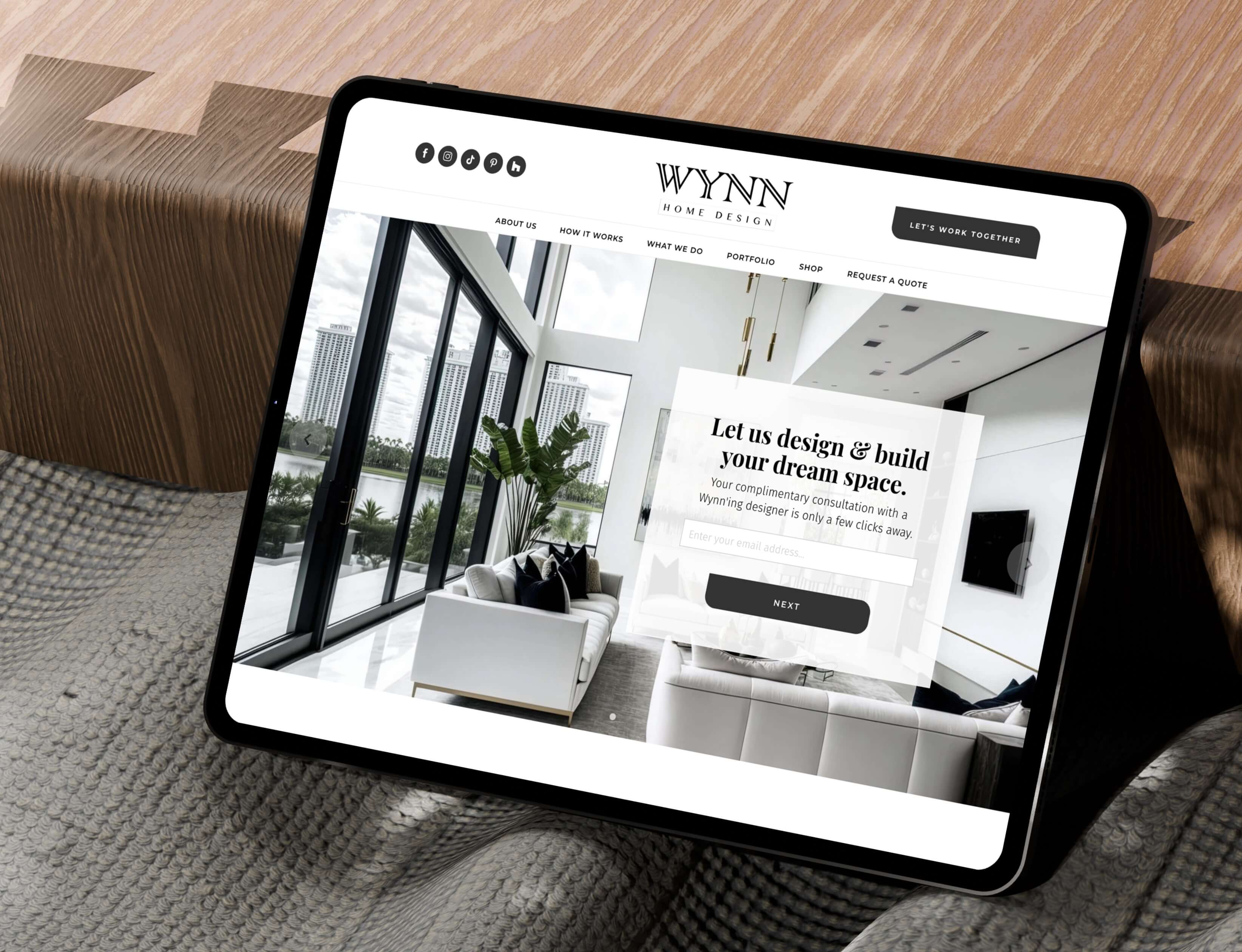
- Wynn Home Design UX Design
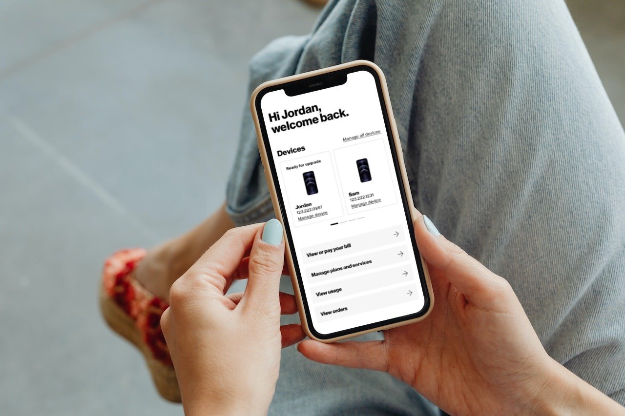
- User Account Dashboard UX Design
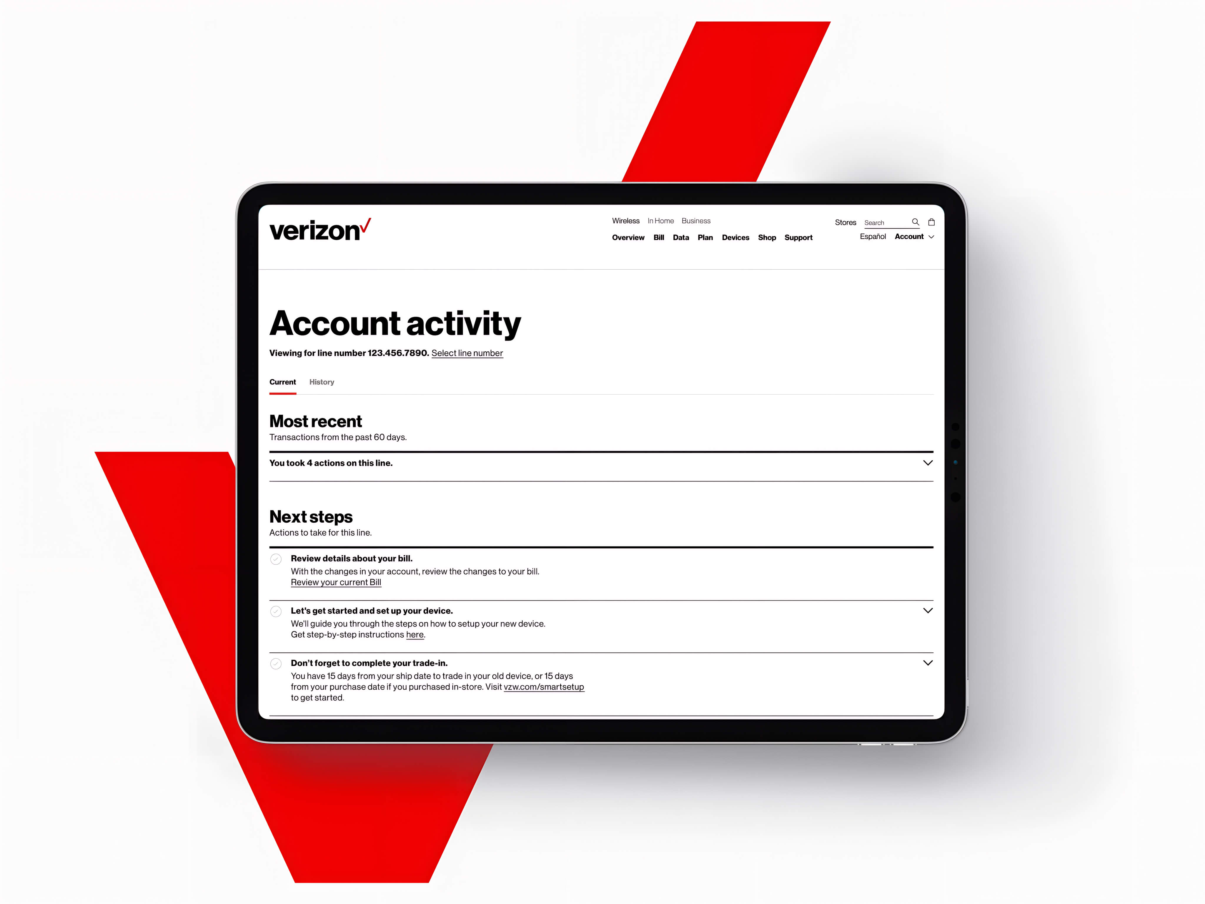
- User Account Activity UX Design
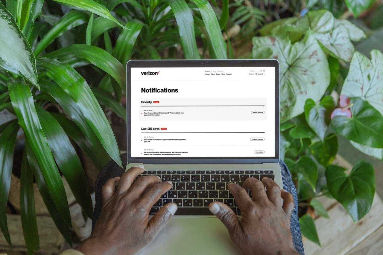
- Notifications Experience UX Design
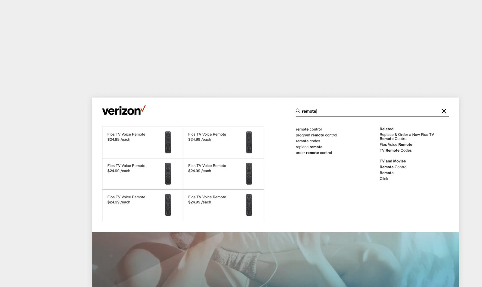
- Fios Navigation Frontend Development
- Save Brass Web Development
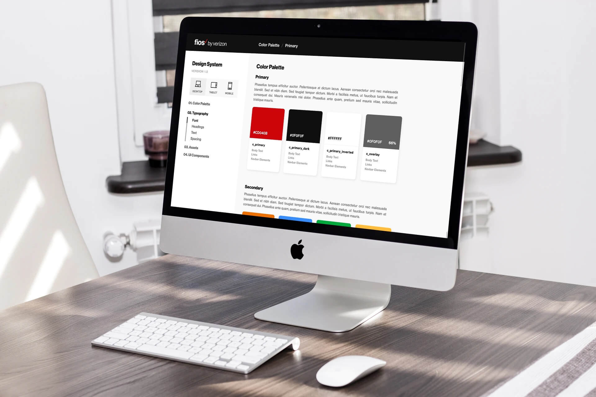
- Fios Design System Frontend Development
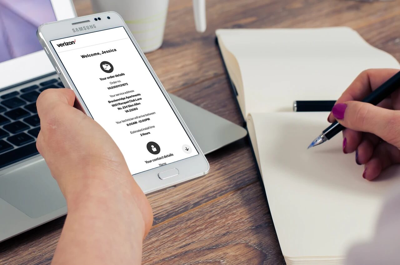
- Life on Fios Frontend Development
- Outfit Barn Web Development
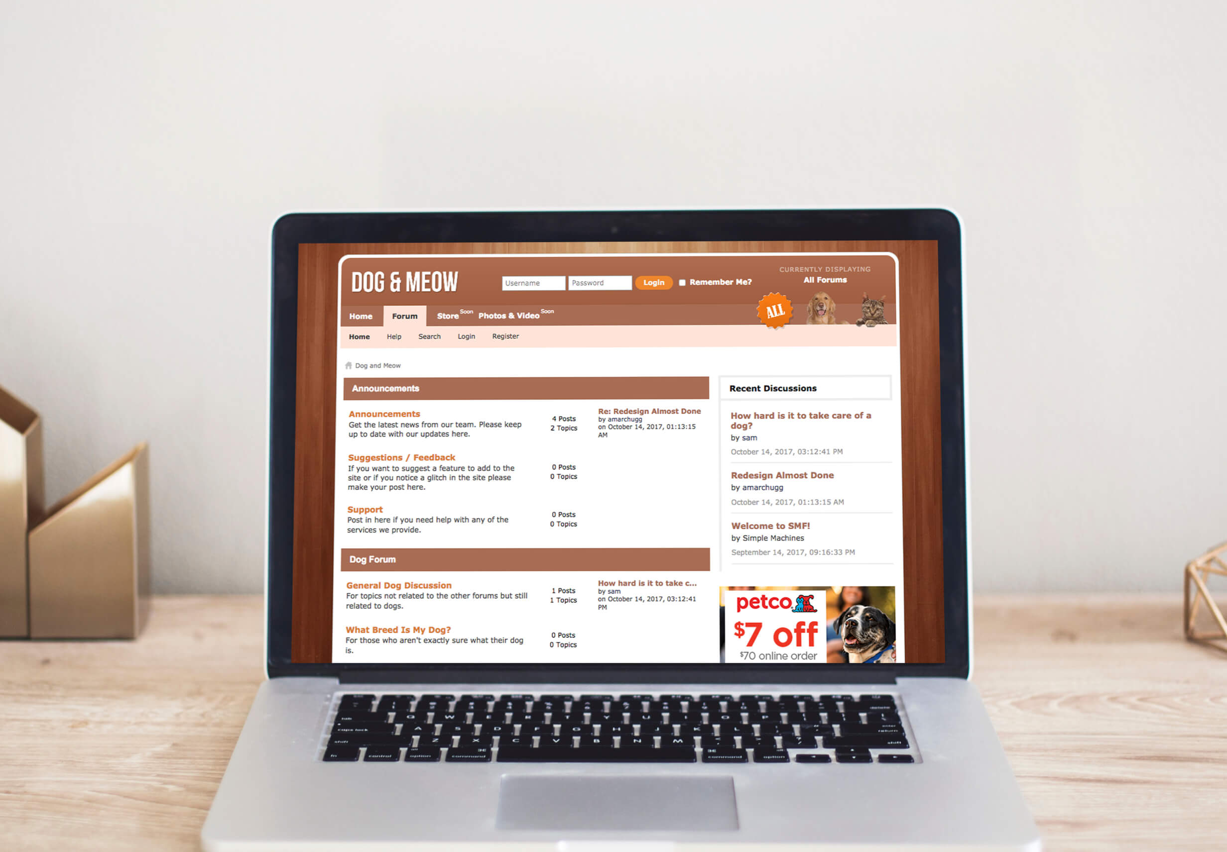
- Dog & Meow Web Development
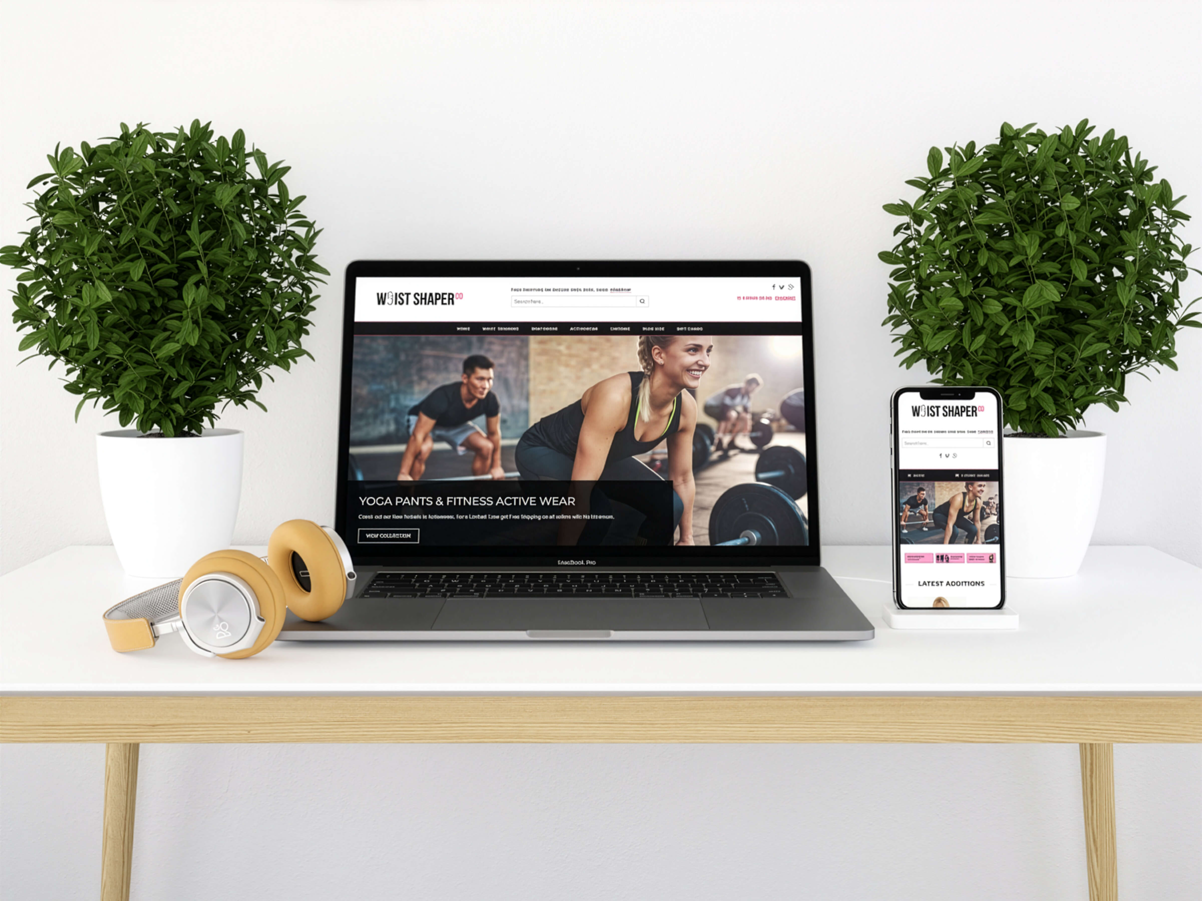
- Waist Shaper Co Web Design
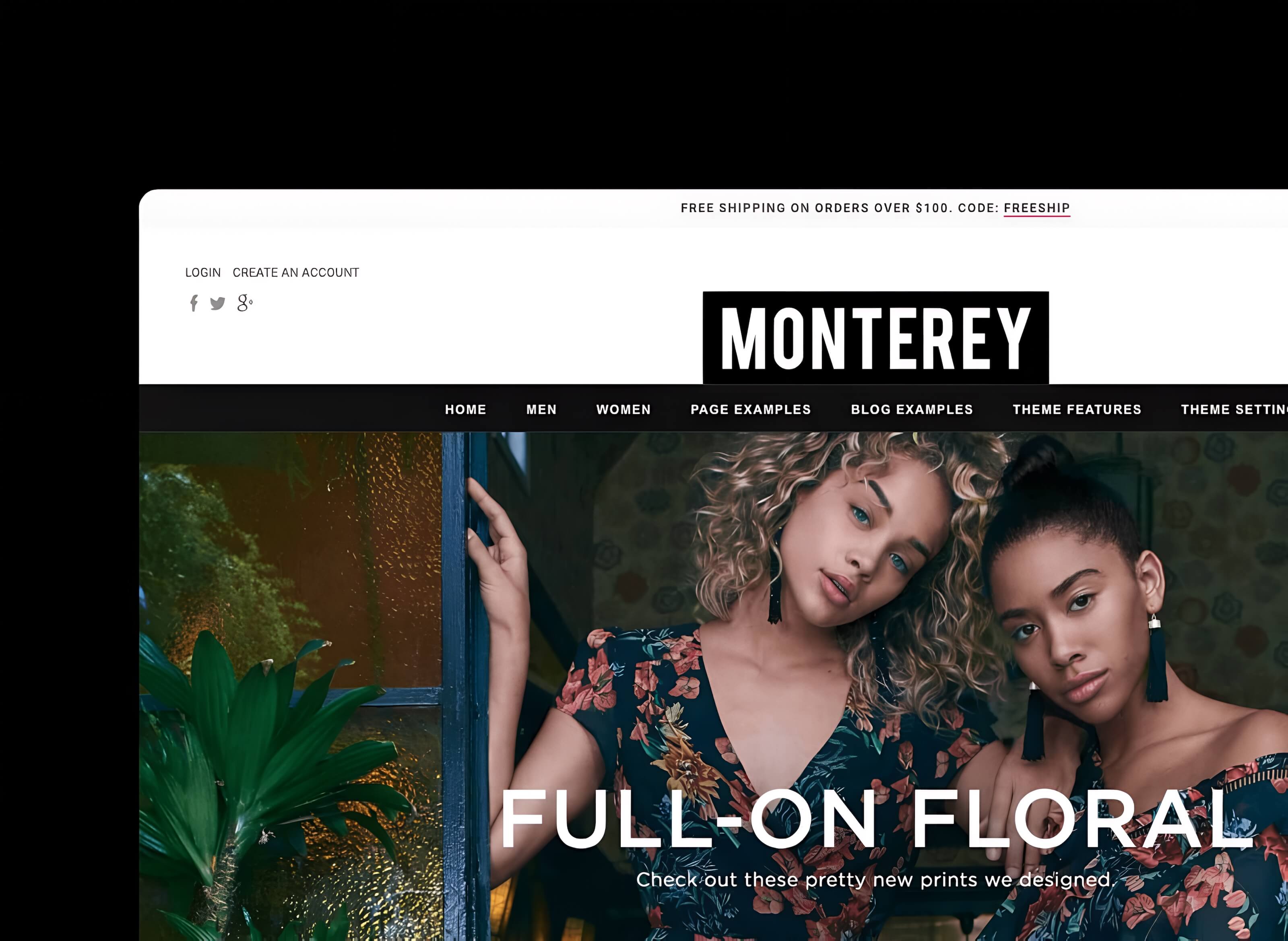
- Monterey Web Development
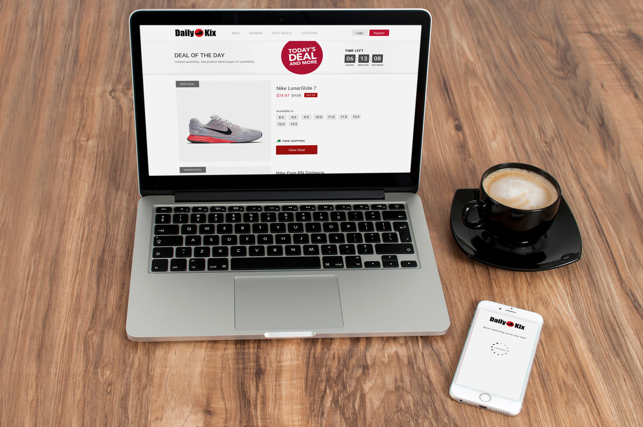
- Daily Kix Web Development
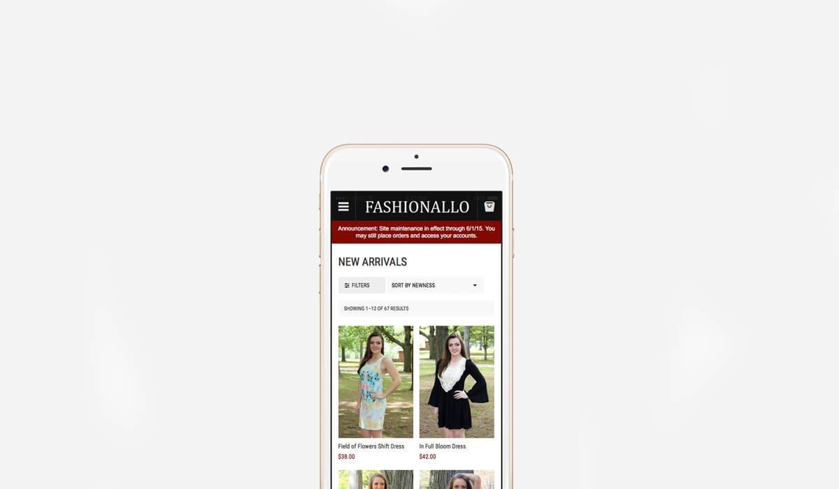
- Fashionallo Web Development
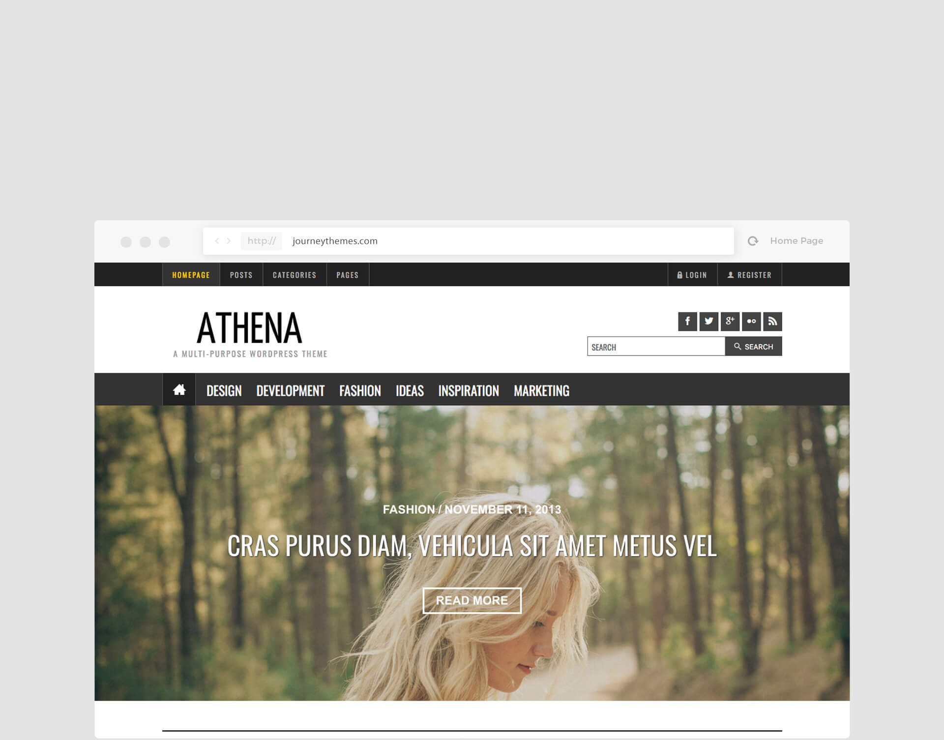
- Athena Web Development
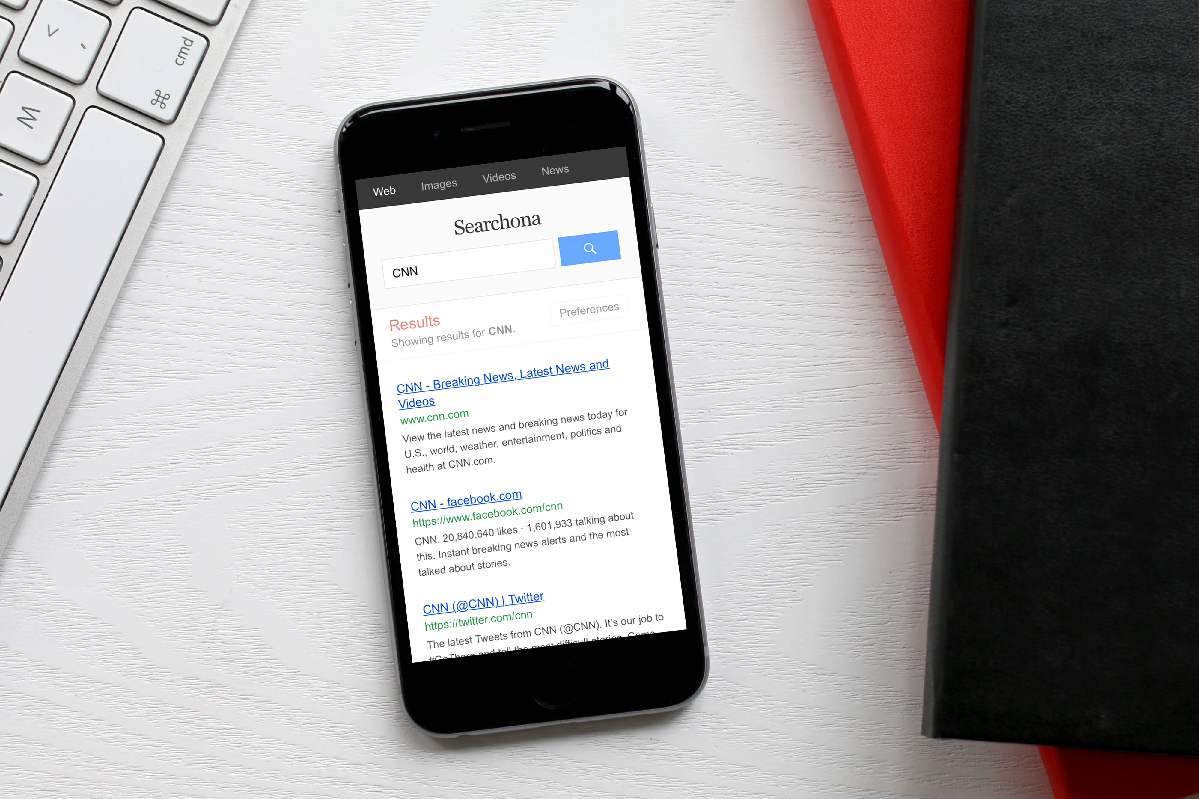
- Searchona Web Development
- InkHotels Web Design
Design and Development
Save Brass
01 Overview
Running a business is expensive. Insurance, accounting software, legal services, tools, subscriptions. The costs add up quickly, and most small business owners and entrepreneurs pay retail for all of it. The client behind Save Brass wanted to change that.
The idea was a membership platform built specifically for business owners: pay a monthly fee, get access to a curated set of negotiated discounts and partnerships that would collectively save members far more than the cost of the membership itself. Think Netflix for business savings, or Costco for entrepreneurs. The value was not in a single product. It was in the aggregated benefit of belonging.
The client was actively building the partner relationships that would populate the platform, with deals like saving hundreds of dollars a year on business taxes, or reducing insurance premiums by a meaningful percentage. The platform needed to reflect that value clearly, make joining feel worthwhile from the first visit, and give members a seamless way to access and manage their benefits once they were in.
Company
Immigrant Biz, LLC
Timeline
5 months (2018–2018)
Role
Full Stack Developer
Platforms
Desktop Web, Mobile Web
Stack
HTML, Javascript, CSS, PHP (Custom WordPress Theme Development)
Tools
VS Code, Sketchapp, Invision, Github
02 Scope
The full picture of what this project required.
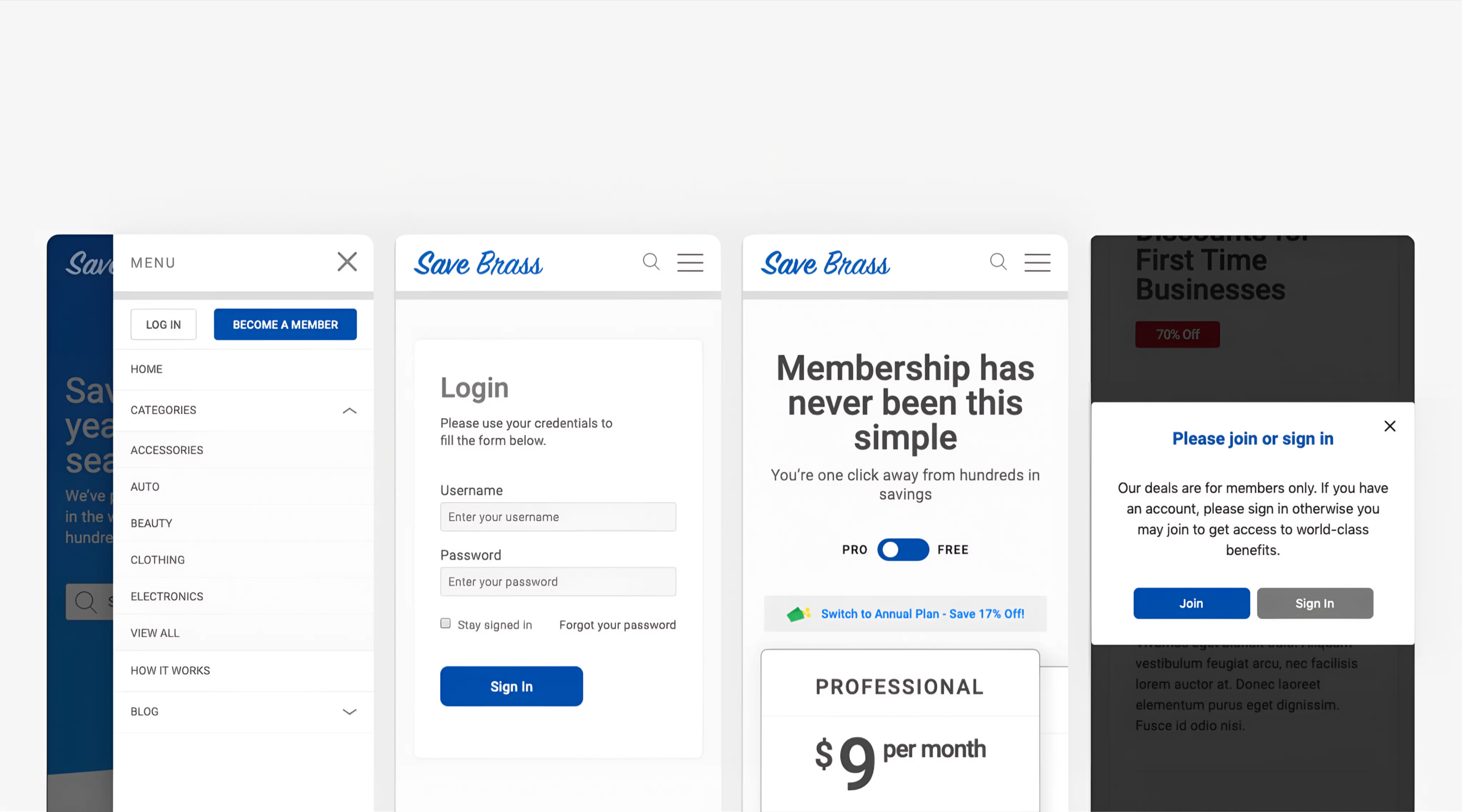
The client needed a membership platform built from scratch that could serve two distinct audiences: prospective members who needed to understand the value before signing up, and active members who needed a clean, reliable place to access their benefits and manage their account.
The platform had to handle tiered memberships with gated content, a browsable catalog of partner offers, recurring payments, and the ability for members to sign up, upgrade, or downgrade at any time. It also had to be maintainable by a small team without ongoing development support after launch. Fixed budget. Fixed timeline. Built to last.
Design
Full site design from scratch
Every page designed from zero: marketing pages, membership comparison, partner offer catalog, member dashboard, and account management flows.
Development
Custom theme and front end
A fully custom-built front end with no template as a starting point, giving complete control over the markup, styles, and component structure.
Membership
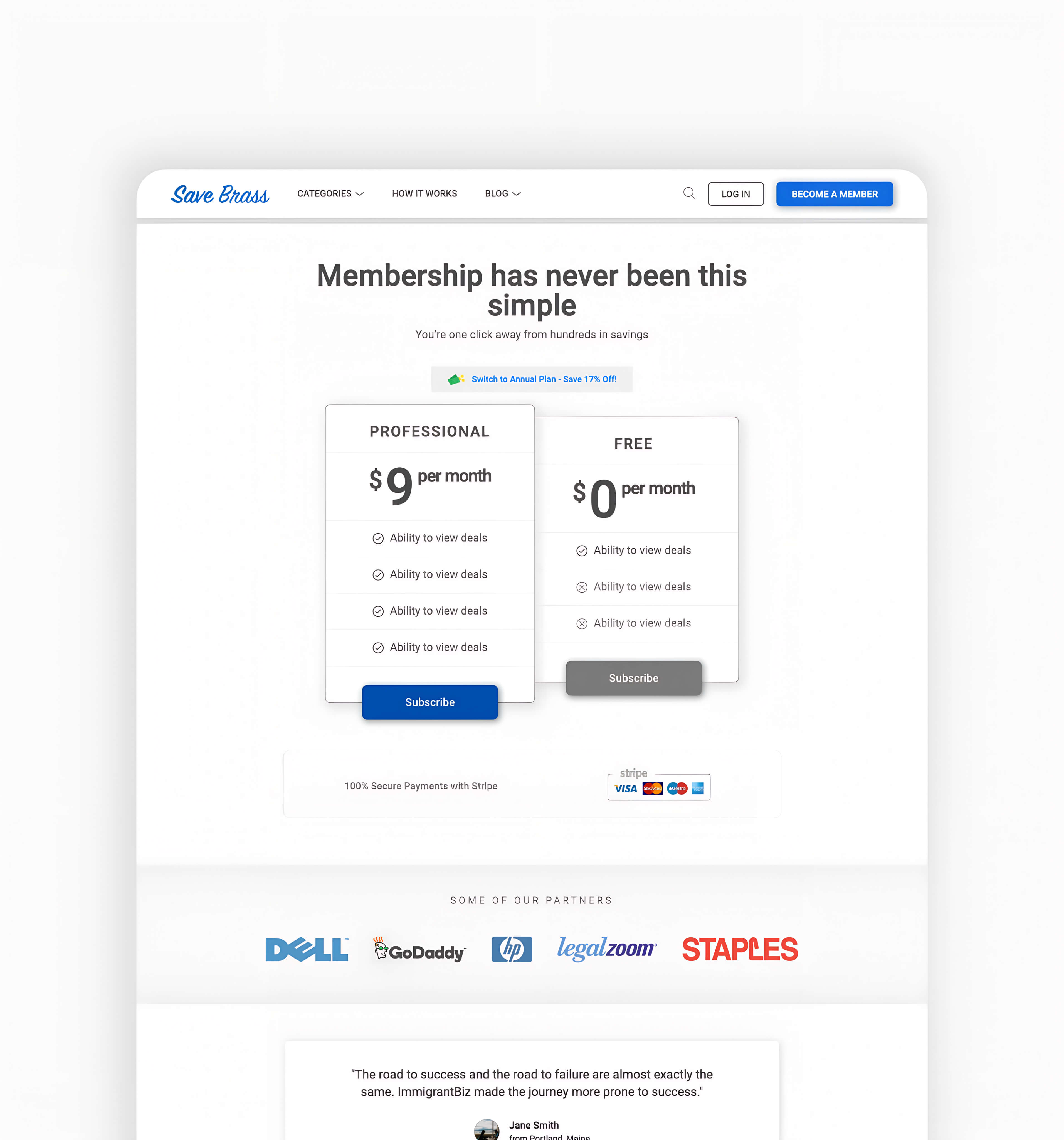
Tiered access and gating
Content and offers visible or restricted by membership level, with the ability to upgrade or downgrade at any time without friction.
Payments
Billing and subscriptions
Full membership lifecycle handled on-site: sign-up, recurring billing, plan changes, and account management without leaving the platform.
03 Solution
One build covering design, development, payments, and membership logic.
Given the budget and timeline, WordPress extended with Advanced Custom Fields was the right foundation. It gave the client a CMS they could manage independently, a plugin ecosystem mature enough to handle membership and payment functionality without custom engineering, and enough flexibility to build a bespoke front-end experience on top of it. Custom post types and custom fields were built into the theme, with access rules configured to control what each membership tier could see. Adding a new partner deal or adjusting tier access required no development involvement after launch.
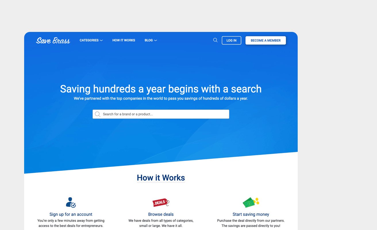
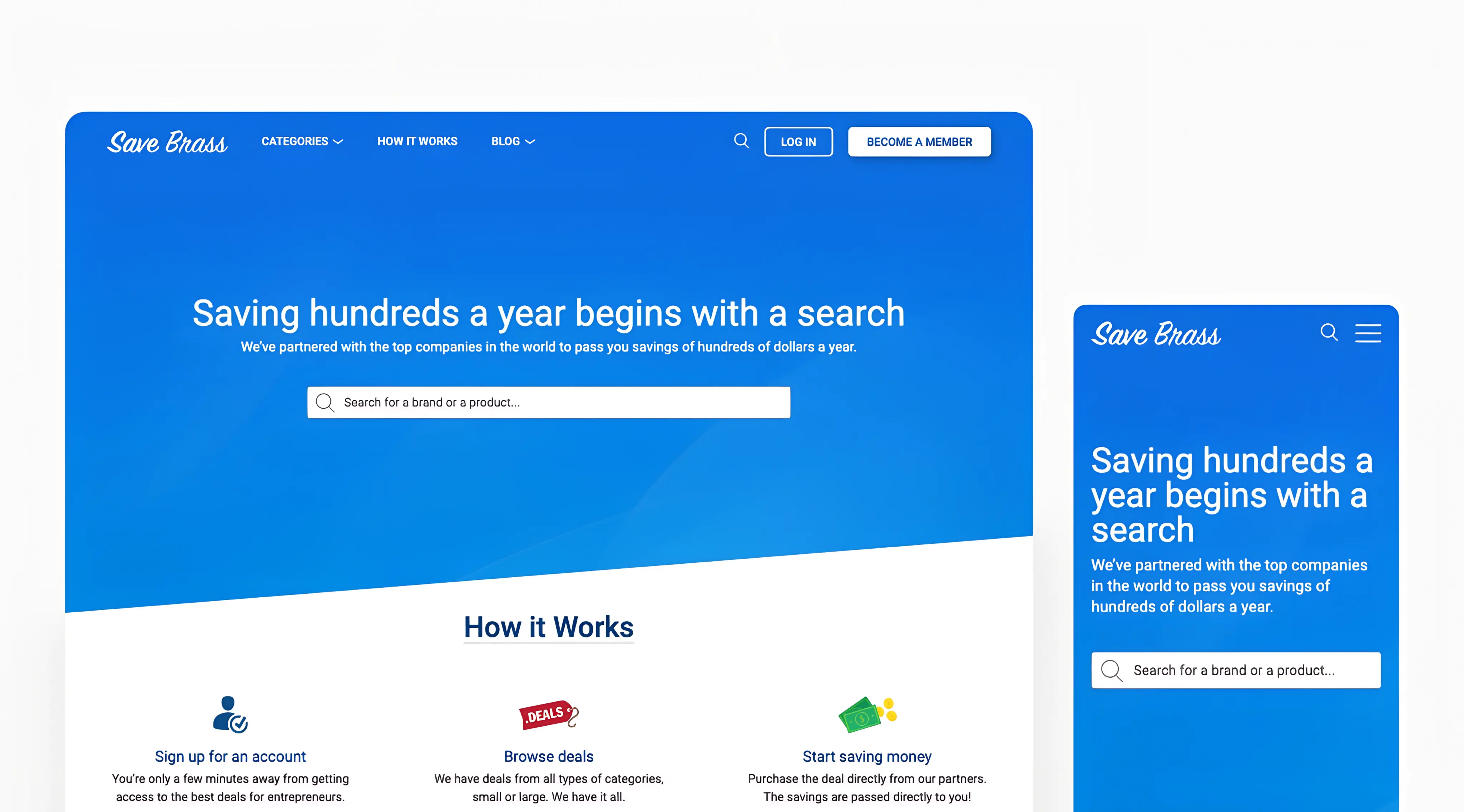
The design challenge was making the value proposition legible at a glance. A visitor landing on Save Brass for the first time needed to immediately understand what they were getting, how much they would save, and why the membership fee was worth it. The homepage leads with a search so visitors can check whether savings exist for their specific needs right away. It explains how the platform works in plain terms, previews the membership tiers clearly, and gives prospective members enough of a look at the partner catalog that the value feels real before they have paid anything.
Once inside, the experience shifted to utility. The member dashboard surfaced the active plan, accessible offers, and account management in a clean layout. Everything a member needed was reachable from one place without unnecessary navigation.
04 My role
Full ownership from the first sketch to the last deploy.
Every part of this project was done by me. Design in Figma, front end in code, CMS architecture, membership logic, payment integration. I wanted to use Beaver Builder with a child theme as a starting point but ultimately had to build a custom theme from scratch to get full control over the markup and styling and maintain pixel-perfect fidelity to the designs.
The overall project was a high-effort mix of using existing tools where they served the goal and building custom solutions where they did not. The result is an experience that feels native and cohesive from end to end, and a CMS the client can manage and grow without coming back to a developer for routine updates.