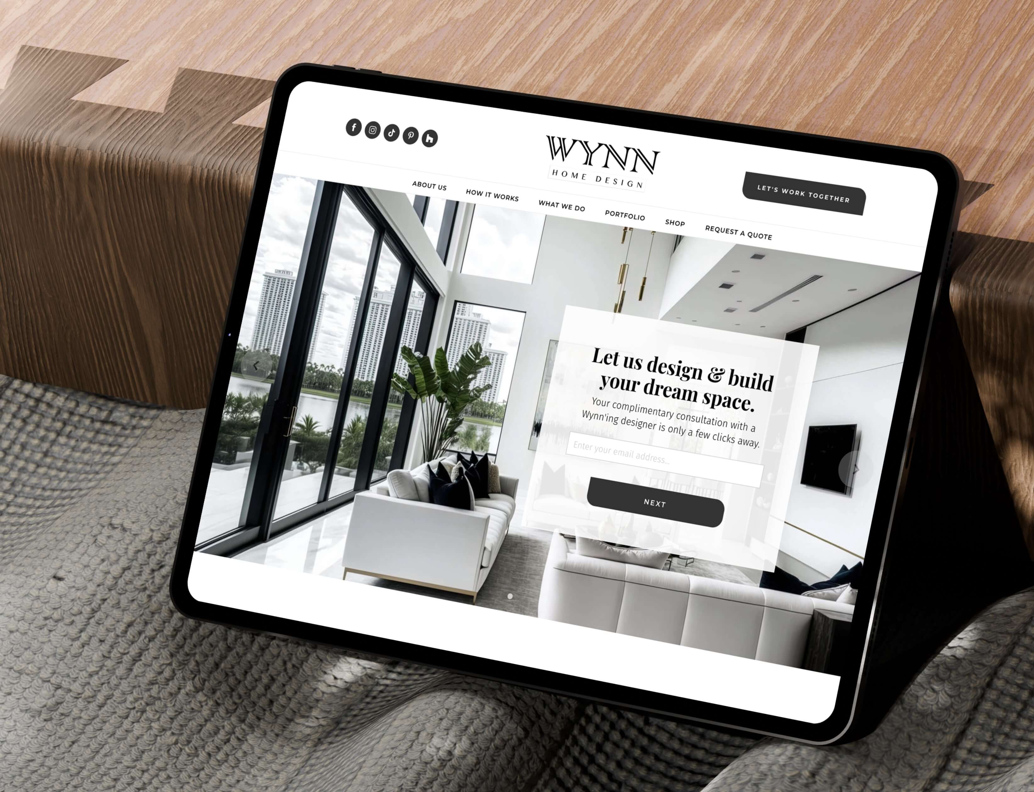


- Wynn Home Design UX Design
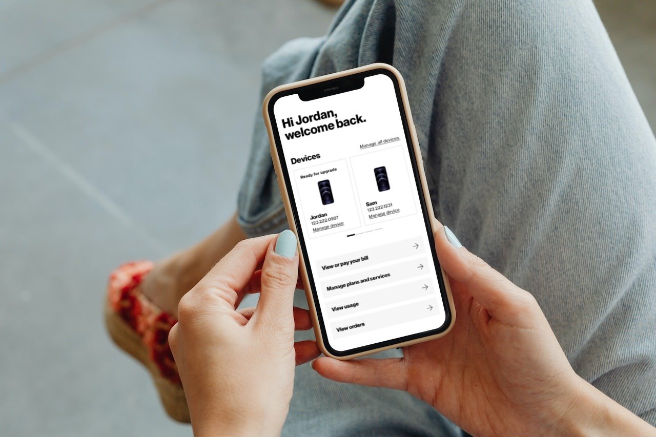
- User Account Dashboard UX Design
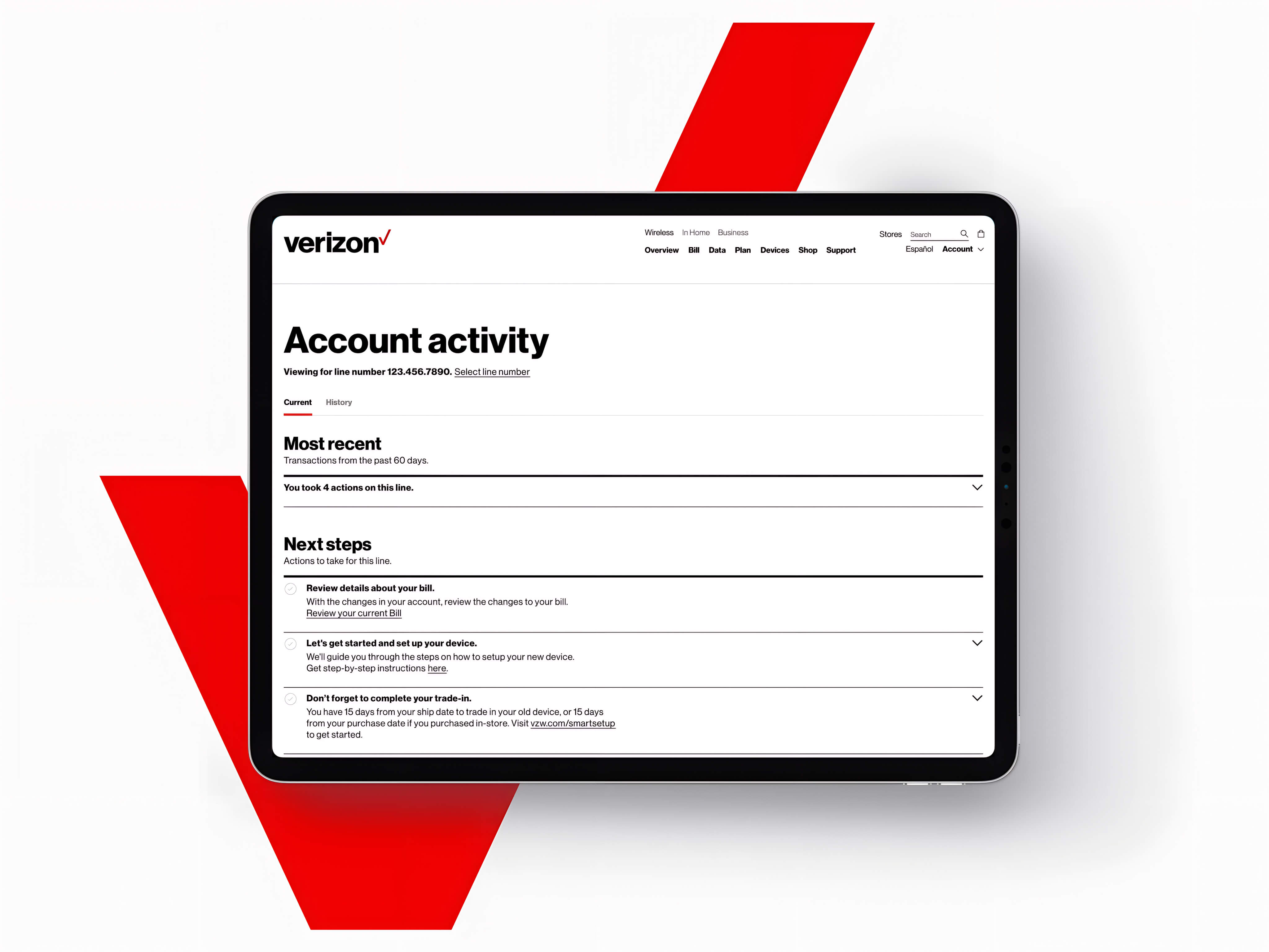
- User Account Activity UX Design
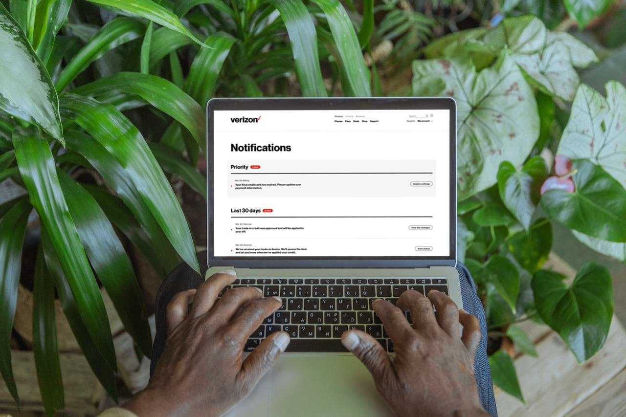
- Notifications Experience UX Design
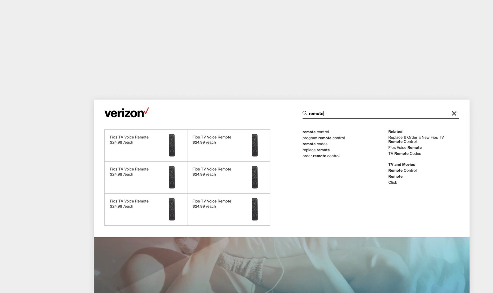
- Fios Navigation Frontend Development
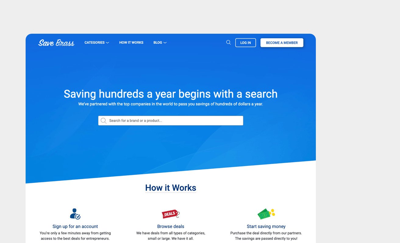
- Save Brass Web Development
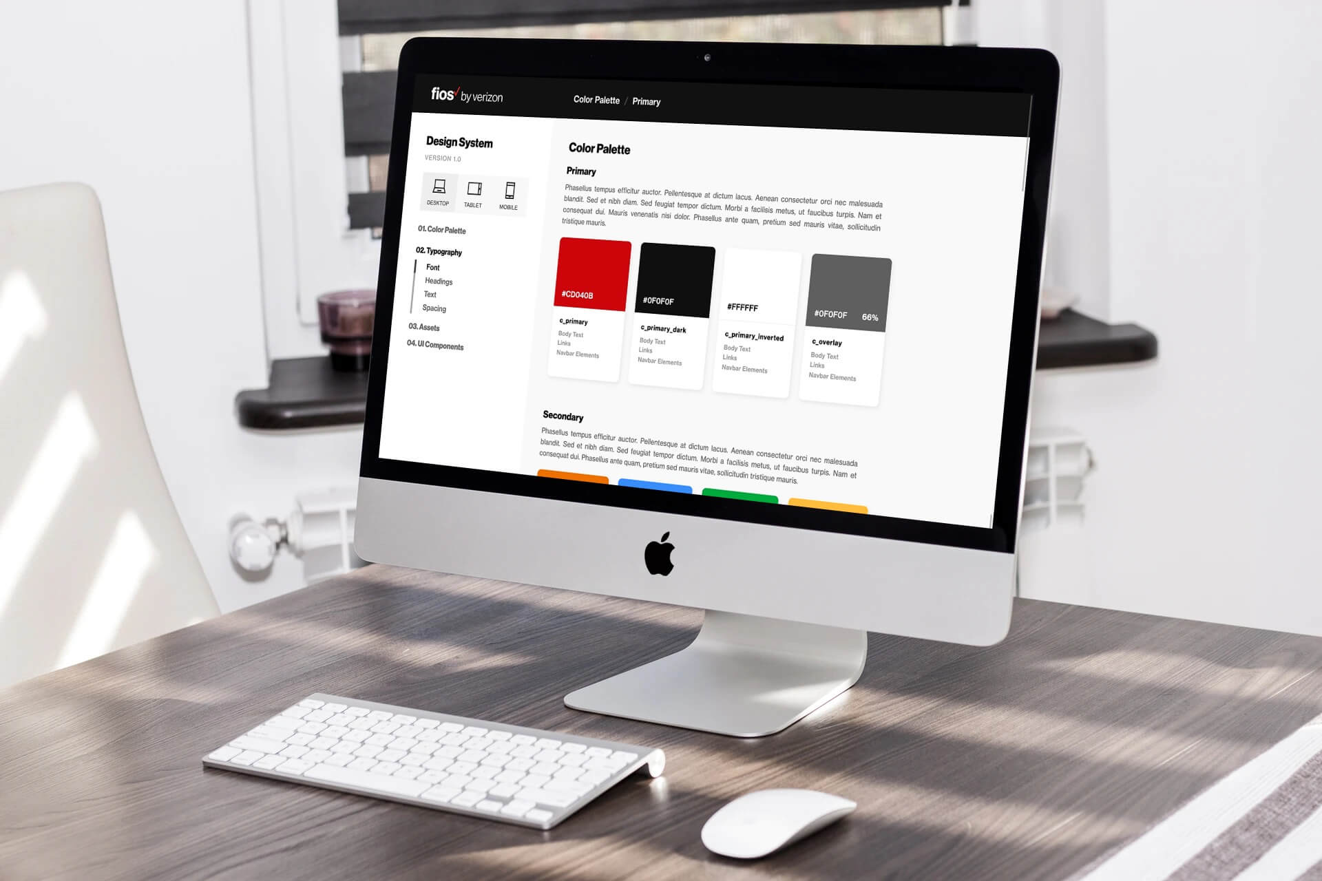
- Fios Design System Frontend Development
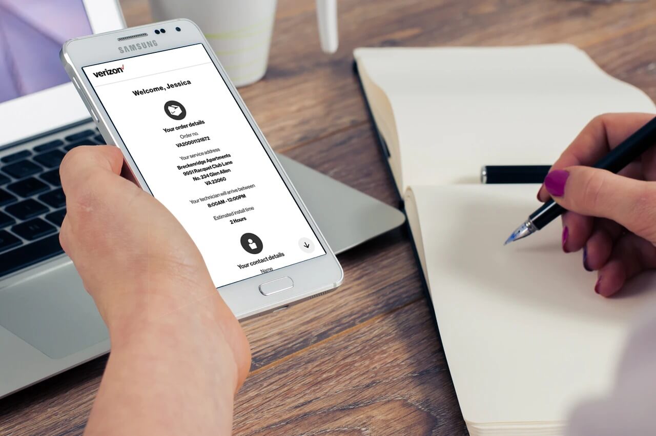
- Life on Fios Frontend Development
- Outfit Barn Web Development
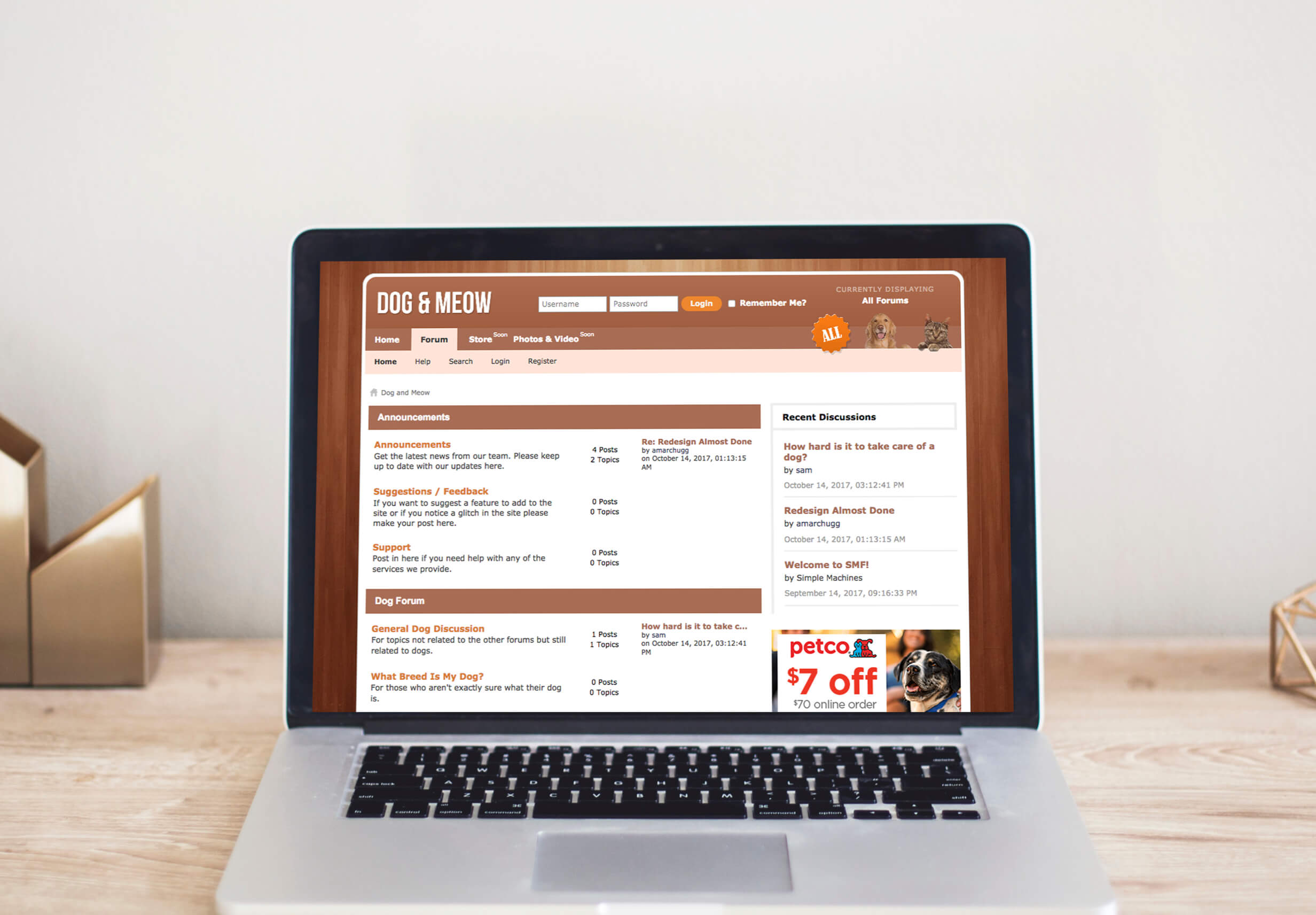
- Dog & Meow Web Development
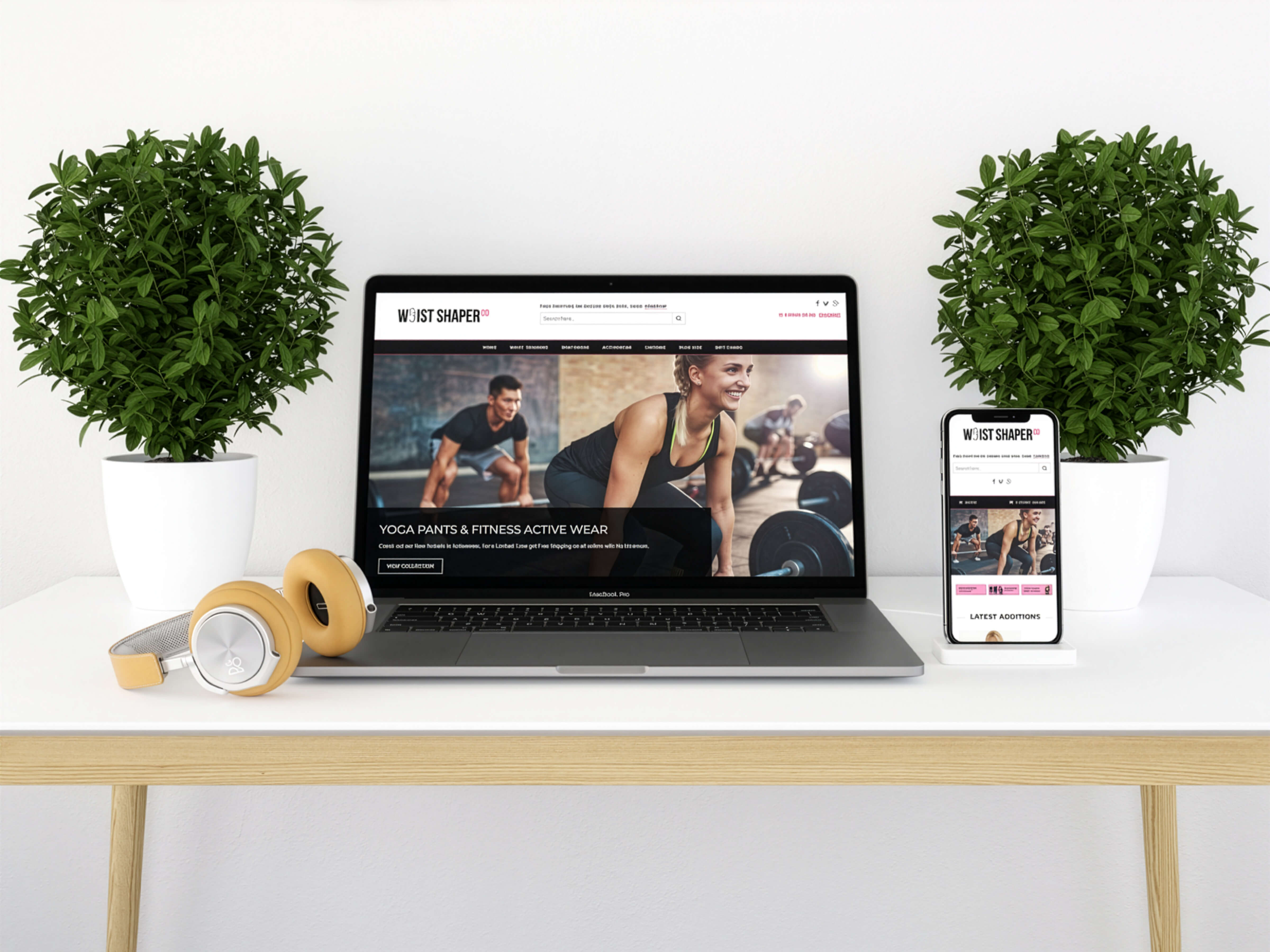
- Waist Shaper Co Web Design
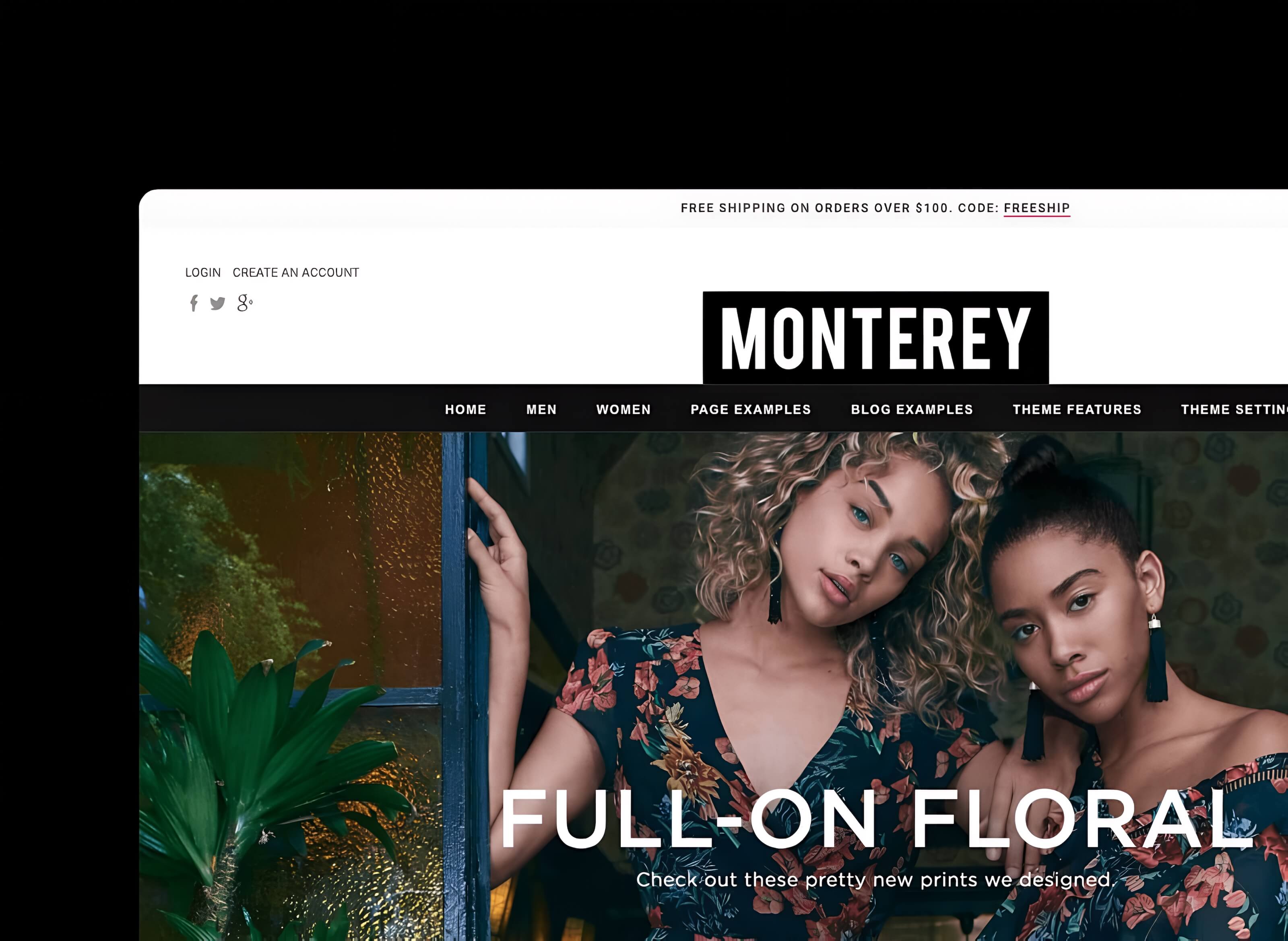
- Monterey Web Development
- Daily Kix Web Development
- Fashionallo Web Development
- Athena Web Development
- Searchona Web Development
- InkHotels Web Design
Design and Development
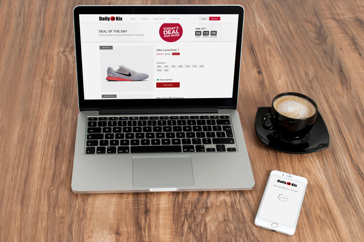
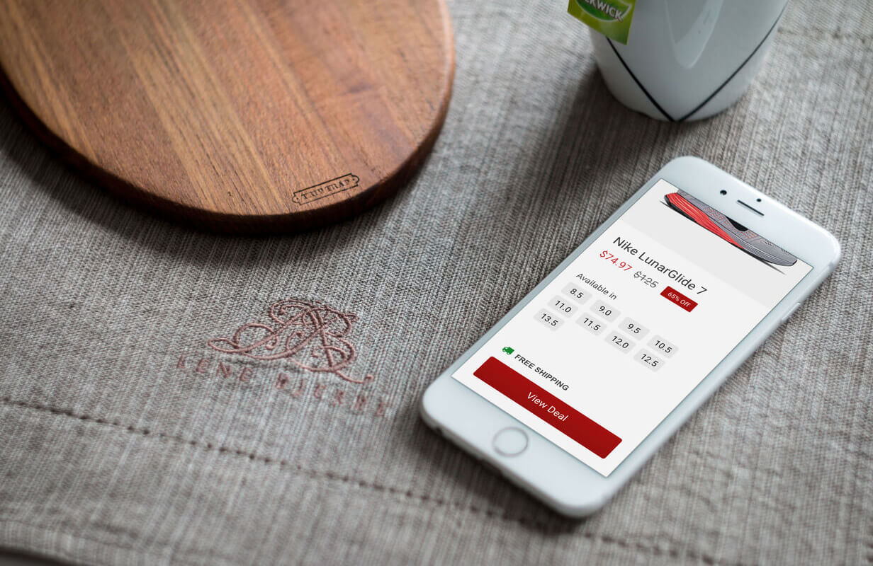
Daily Kix
01 Background
Sneakers occupy a unique space in retail. They are simultaneously everyday footwear and a collector’s market, with releases that sell out in minutes and deals that disappear just as quickly. For buyers who care about what they wear on their feet, finding a good price on the right pair requires constant attention across multiple retailers, resale platforms, and deal aggregators.
Daily Kix was built for that buyer. The idea was to do the searching for them: find the best deals on sneakers across the web each day, surface them in one place, and give buyers the information they needed to decide whether to click through before they ever left the site. Real-time availability and pricing, right on the homepage, every day.
Company
Kicknetics
Timeline
3 months (2016–2017)
Role
Full Stack Developer
Platforms
Desktop Web, Mobile Web
Stack
PHP, HTML, Javascript, JQuery, CSS, API (Custom WordPress Theme Development)
Tools
VS Code, Sketchapp, Invision, Adobe Photoshop, Github
02 Idea
Drive concentrated sales by showing the details before click-through.
Most deal aggregator sites operated on a simple model: find a deal, post a link, collect a commission when someone clicks and buys. The conversion problem with that approach is that the buyer knows almost nothing when they click. They land on a retailer’s site and then have to figure out whether their size is available, what the price actually is after any discounts, and whether the deal is still live. A significant portion leave without buying.
The Daily Kix insight was that showing that information before the click would increase the quality of each click-through. A buyer who already knows their size is in stock and the price is what they expected is a far more qualified visitor than one arriving cold. That specificity was the core mechanic of the product and the reason the conversion rate premise was sound.
01
Real-time size availability
Available sizes were displayed on the Daily Kix homepage before any click-through. Buyers could see immediately whether their size was in stock without visiting the retailer.
02
Live pricing on the deal card
Current pricing was surfaced directly on each deal card so buyers knew exactly what they were clicking toward. No surprises on landing. Higher intent on arrival.
03
Daily featured releases
New deals were featured each day, creating a reason to return regularly. Buyers who did not find their size in the day's main feature stayed to browse others, increasing time on site and the chance of a conversion elsewhere.
03 Solution
A homepage built to keep buyers informed and steady moving.
The homepage was the entire product. It needed to surface deals in a way that was visually compelling, easy to scan, and informative enough that a buyer could make a go or no-go decision without leaving the page. The design prioritized the deal card as the primary unit: a clear image of the sneaker, the price, the available sizes, and a link to buy. Everything else on the page served that unit.
The retention mechanic was built into the structure. A buyer who opened the page looking for a specific release would see the day’s featured deal first. If their size was not available, the layout gave them an immediate path to the rest of the day’s deals rather than a dead end. Time on site increased because the experience was designed to keep buyers browsing rather than bouncing, which in turn meant more opportunities for a qualifying click-through on something else.
The affiliate model was straightforward: every purchase made after a click from Daily Kix generated a commission. The real-time sizing and pricing information was the differentiator that made those clicks more valuable than a standard aggregator, because the buyers arriving at a retailer through Daily Kix had already self-selected based on availability and price.
04 My role
Designed and built for Kicknetics
Daily Kix was built for Kicknetics, a sneaker retailer. I designed and built the site, sourced the deals, and worked to keep the homepage current and the deal cards accurate. The design work centered on the deal card as a unit: getting the right information into the right amount of space in a way that was immediately scannable for a buyer who might be checking the site quickly to see if today’s drop was worth their time.
The real-time sizing and pricing mechanic was the most technically interesting part of the build. Surfacing that information accurately required pulling live data from retailer sources and presenting it in a format that was useful rather than overwhelming. The goal was always a buyer making a fast, informed decision, so the data had to be current, the layout had to be clean, and the path to the retailer had to be frictionless once the decision was made.
Running a daily deal site solo meant the editorial side was as much work as the technical side. Curating deals that were genuinely good, checking availability before featuring them, and keeping the homepage feeling fresh every day required consistent attention. The product worked because the curation was honest. Deals that were mediocre or already sold out in most sizes did not get featured, which kept the click-through quality high and the trust of returning visitors intact.